Something doesn't feel right
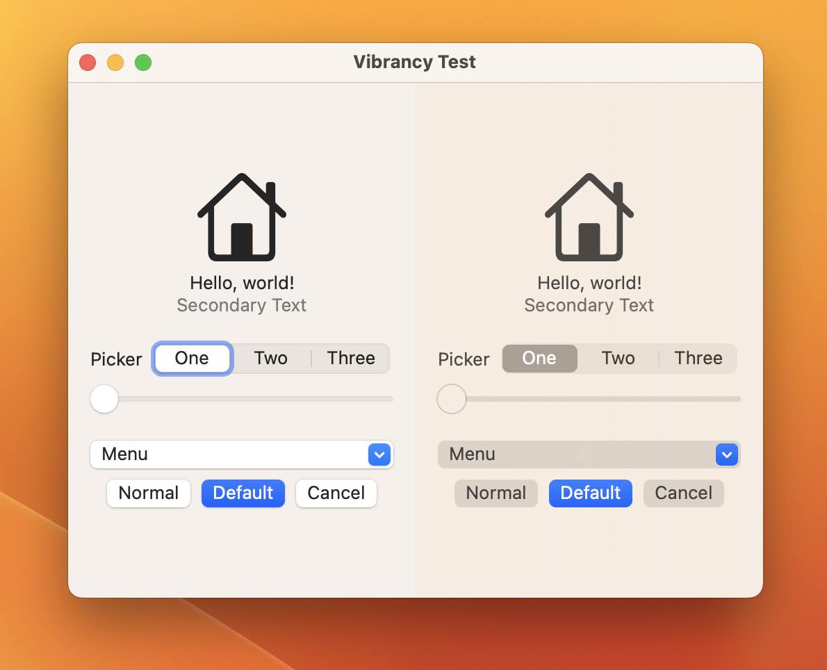
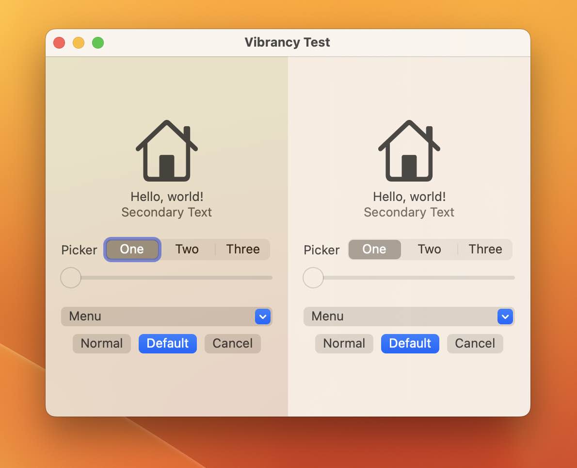
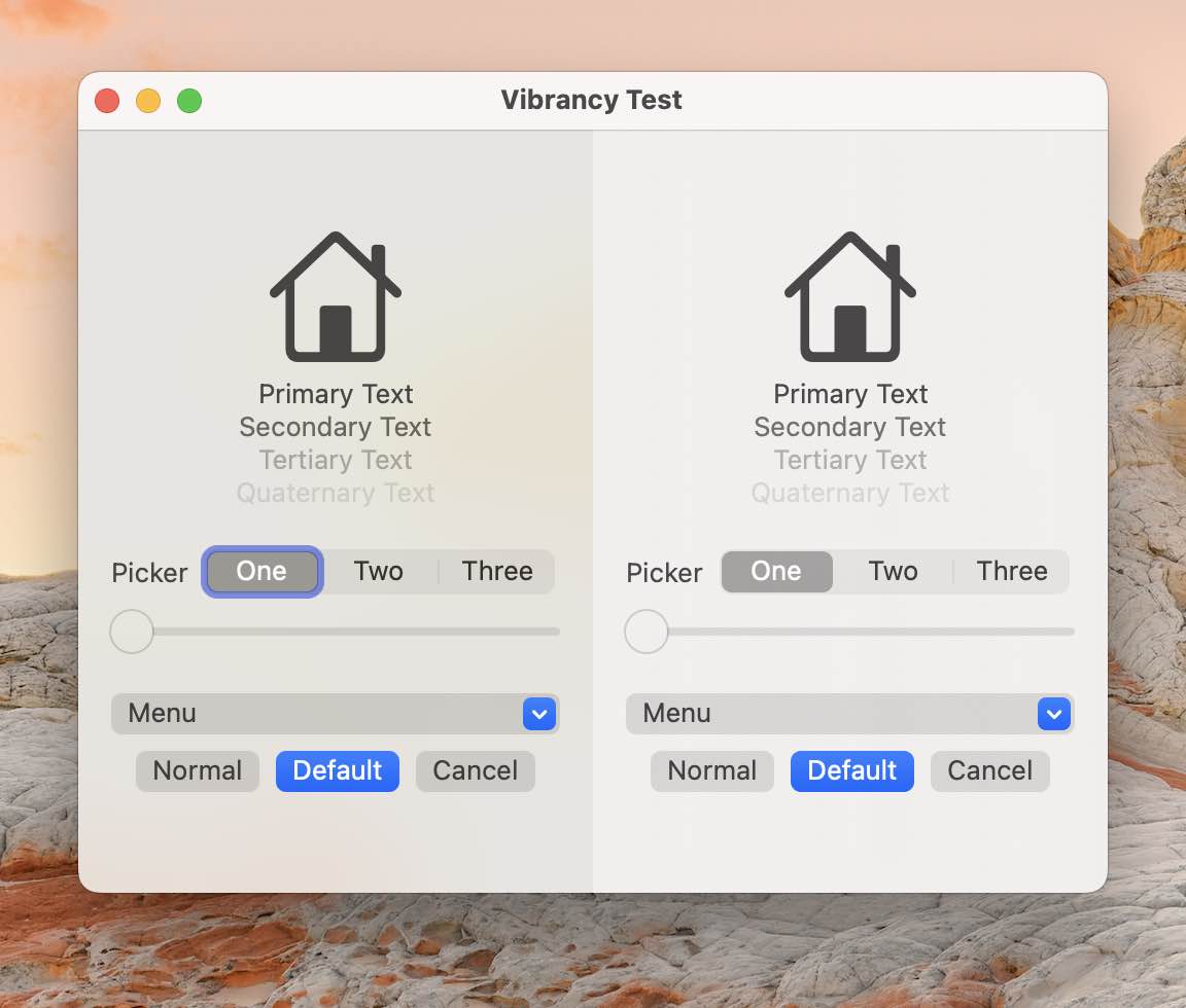
While it was easy to make a panel vibrant in SwiftUI, I had this pit of the stomach feeling that it wasn't matching AppKit apps. So I made a comparison. SwiftUI on the right and the AppKit NSVisualEffectView on the left.
HStack( spacing: 0 ){
Test_Controls()
.background(VisualEffectView(material: .sidebar))
Test_Controls()
.background(.ultraThinMaterial)
}
The NSVisualEffectView is allowing more blending of what's behind the window, while the native SwiftUI seems to use just a hint of the desktop picture. When compared like this, it doesn't even look like the right hand side has any vibrancy.
But... Adding a NSVisualEffectView, doesn't make the controls vibrant, only the background.
The code to use AppKit's NSVisualEffectView in SwiftUI is below.
import AppKit
import SwiftUI
public struct VisualEffectView: NSViewRepresentable {
var material: NSVisualEffectView.Material
var blending: NSVisualEffectView.BlendingMode = .behindWindow
public func makeNSView(context: Context) -> some NSVisualEffectView {
let view = NSVisualEffectView()
view.material = material
view.blendingMode = blending
return view
}
public func updateNSView(_ nsView: NSViewType, context: Context) {}
}