Swift and SwiftUI Products Help Contact

SwiftUI macOS Toolbar

Examples of the kinds of macOS Toolbars, and tips.

The Toolbar is a convenient means of providing customers with easy to access buttons to perform tasks. There's several ways to create a toolbar and a bunch of options for it also.

Created using Ventura and Xcode 15.2. Published: April 28th 2025

1. Simple Buttons

The simplest Toolbar of all is just to use Buttons.

var body: some View { VStack { // ... } .padding() .toolbar { Button( "Cut", systemImage: "scissors" ) {} Spacer() Button( "Copy", systemImage: "doc.on.doc" ) {} Button( "Paste", systemImage: "doc.on.clipboard" ) {} Button( "Delete", systemImage: "trash", role:.destructive ) {} } }

2. Buttons with Labels

This is a style I like because it includes labels with the icons, but for a lot of items clipping can occur which then looks wrong. There is another style that includes labels as we'll see later on.

.toolbar { Group { Button( "Cut", systemImage: "scissors" ) {} Spacer() Button( "Copy", systemImage: "doc.on.doc" ) {} Button( "Paste", systemImage: "doc.on.clipboard" ) {} Button( "Delete", systemImage: "trash", role:.destructive ) {} } .labelStyle(.titleAndIcon) }

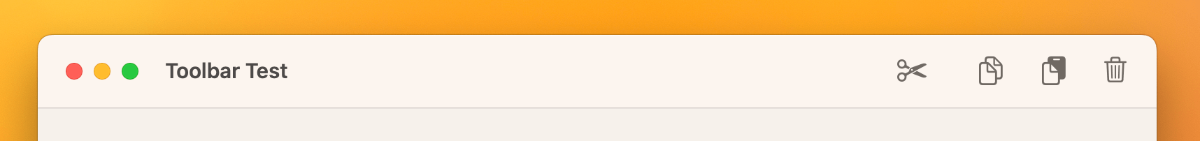
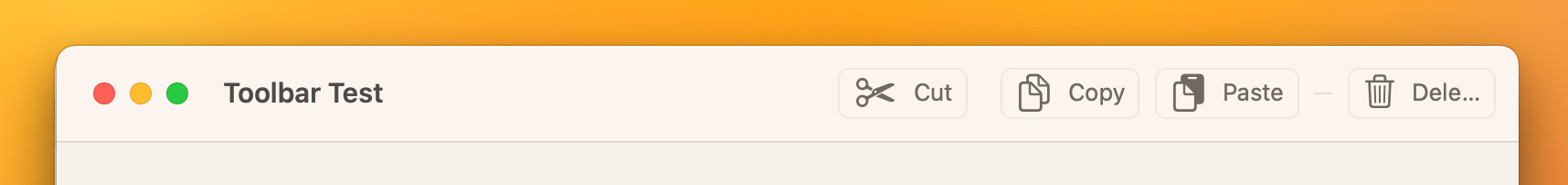
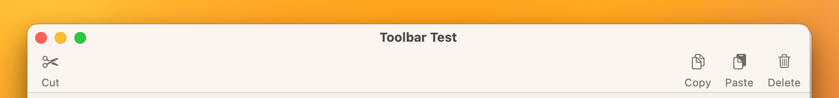
3. Customizable Toolbar

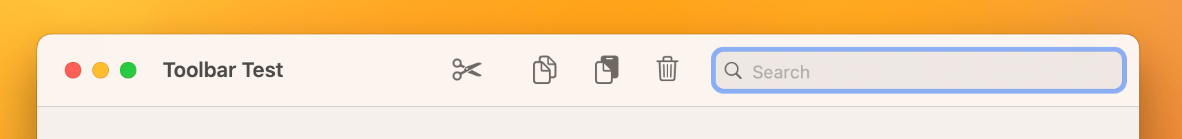
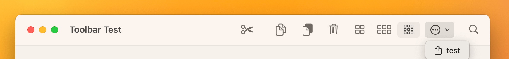
This is the most correct way to code a toolbar as it allows for user customization, which includes showing labels and rearranging the items. The image above is after "Icon and Text" has been selected from the contextual menu for the toolbar. Customization requires an id be supplied to the toolbar and each item should have a unique id. Any user customization is automatically saved and restored.

.toolbar(id:"mainToolbar") { ToolbarItem(id:"cutButton") { Button( "Cut", systemImage: "scissors" ) {} } ToolbarItem(id:"spacer") { Spacer() } ToolbarItem(id:"copyButton") { Button( "Copy", systemImage: "doc.on.doc" ) {} } ToolbarItem(id:"pasteButton") { Button( "Paste", systemImage: "doc.on.clipboard" ) {} } ToolbarItem(id:"deleteButton") { Button( "Delete", systemImage: "trash", role:.destructive ) {} } ToolbarItem(id: "magicButton" ) { Button( "Magic", systemImage: "graduationcap" ) {} } .defaultCustomization(.hidden) }

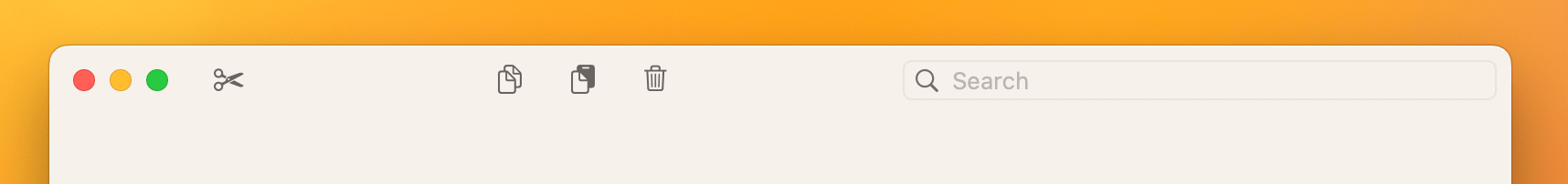
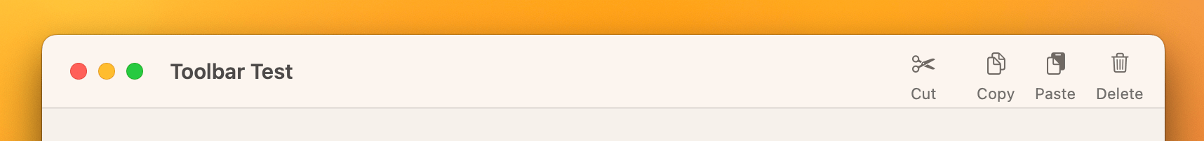
The optional modifier .defaultCustomization(.hidden) hides the toolbar item by default, this is useful for scenarios where the average customer might not need such a button.

4. Expanded Toolbar

If your Toolbar has lots of default items, the expanded option is available. Simply specify .windowToolbarStyle(.expanded) on the window scene.

@main struct Toolbar_TestApp: App { var body: some Scene { WindowGroup { ContentView() } .windowToolbarStyle(.expanded) } }

4. Unified Compact Toolbar

In the opposite direction, a unified compact toolbar is smaller than the other options. Use .windowToolbarStyle(.unifiedCompact) on the window scene.

@main struct Toolbar_TestApp: App { var body: some Scene { WindowGroup { ContentView() } .windowToolbarStyle(.unifiedCompact) } }

5. Search field

Adding a search field to the toolbar is easier than you think, simply add the .searchable(text:) modifier to a view within your content view.

struct ContentView: View { @State private var searchString: String = "" var body: some View { VStack { ... } .searchable( text: $searchString, prompt: "Search" ) .toolbar(id:"mainToolbar") { ... }

6. Keyboard shortcuts

You can give toolbar items a keyboard shortcut so the customer doesn't even have to move the mouse to activate an item.

ToolbarItem(id:"cutButton") { Button( "Cut", systemImage: "scissors" ) {} .keyboardShortcut("x", modifiers: .command) }

7. Placement

With the unified or automatic toolbar placement, toolbar items start on the far right and fill in towards the left. You can make a Toolbar item fill in from the left, Apple calls this "Navigation" placement and to be consistent with other applications, it's probably best NOT to put any other buttons than nav buttons there.

ToolbarItem(id:"cutButton", placement: .navigation) { Button( "Cut", systemImage: "scissors" ) {} .keyboardShortcut("x", modifiers: .command) }

8. Provide more helpful hints

For better accessibility, you can provide a more detailed description of what a button does, so when the customer mouses over the button they get a clearer idea of what the button is going to do.

ToolbarItem(id:"cutButton", placement: .navigation) { Button( "Cut", systemImage: "scissors" ) {} .keyboardShortcut("x", modifiers: .command) .help( "Copies the selected text to the clipboard and removes it from the document" ) }

9. Hidden Titlebar

I wouldn't recommend this option, but I've included it incase it's a style that is needed for a particular application. Simply include the .windowStyle(.hiddenTitleBar) modifier on the window scene (like the windowToolbarStyle).

@main struct Toolbar_TestApp: App { var body: some Scene { WindowGroup { ContentView() } .windowStyle(.hiddenTitleBar) } }

10. Other controls

The toolbar can use other controls than just Button, in this example I've added a Picker and a Menu.

ToolbarItem(id: "IconSize") { Picker( "Icon Size", selection: $iconSize) { Label( "Large Icons", systemImage: "square.grid.2x2" ).tag( kIconSizeLarge ) .help( "Display large sized icons" ) Label( "Medium Icons", systemImage: "square.grid.3x2" ).tag( kIconSizeMedium ) .help( "Display medium sized icons" ) Label( "Small Icons", systemImage: "square.grid.3x3" ).tag( kIconSizeSmall ) .help( "Display small sized icons" ) }.pickerStyle(.segmented) } ToolbarItem(id: "action") { Menu("Action", systemImage: "ellipsis.circle") { Group { Button( "test", systemImage: "square.and.arrow.up") {} }.labelStyle(.titleAndIcon) } }

11. Pay attention when using a segmented picker

Putting a segmented picker too close to the search field can result in it becoming trapped and unaccessible from the chevron menu when the search field is highlighted and then loses focus. I have filed this as a bug with Apple FB17392294. It is worth noting that the Finder does not have this problem.

A workaround is to place the segmented picker as the first item in the toolbar, so that it never enters the chevron menu in the first place.

12. Colorizing the Toolbar

Believe it or not, but there's built-in functionality for adjusting the color of the toolbar. Simply add the following modifier to the root view.

.toolbarBackground(.blue, for: .windowToolbar)
  • Sleep Aid, our Mac Sleep troublshooter See what your Mac does when it should be asleep - Sleep Aid
  • Ohanaware © 2007 - 2025 Ohanaware Co., Ltd. Registered in Taiwan R.O.C. 🇹🇼
    Site managed by Strawberry Software's Lifeboat - running on DigitalOcean's platform.

    Pages

    Products Contact Us Weblog SwiftUI Dev Promotions

    Company

    About Us Environment Privacy Terms Update Plans

    Connect

    Bluesky Facebook Threads X / Twitter Mailing List