Saturday, August 1, 2020
Tags
- 10.16
- app
- App Kit
- application
- Big Sur
- mac
- macOS
- OAK2020
- Ohanaware
- realbasic
- realstudio
- xojo
Preparing your Xojo made Mac App for macOS Big Sur
Saturday, August 1, 2020 - Sam Rowlands
Continuing on from the last article, I'm going to talk about some other controls and code that can help complete the look of a Big Sur app.

Full-Height sidebar
Please check out a newer version of the Ohanaware App Kit as we're added convenience classes for the sidebar.
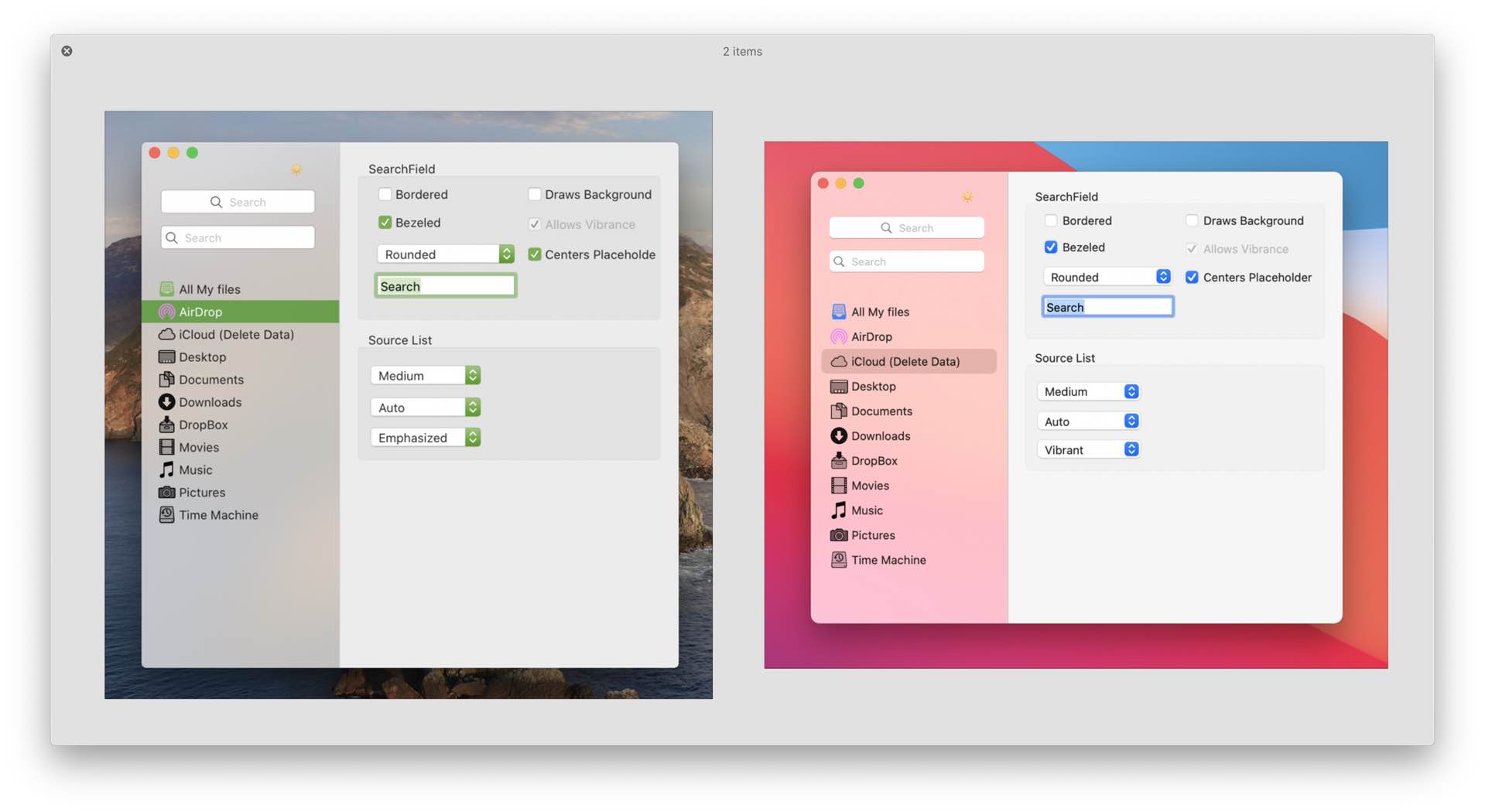
Part of the "Big Sur" look is the full-height sidebars. These are not very difficult to introduce into an existing application, they can look quite good on previous versions of the macOS, yet at the same time feeling quite at home on macOS Big Sur.
- Add a canvas to your window, name it "Contents", resize it fit the window and set the locking properties.
- Move this canvas to the back of the window, then select the controls in the window and press the down arrow on your keyboard and then the up arrow. This will set the contents of your window into the canvas.
- Now move the left edge of the canvas to the right by 222 pixels. This will make space for your sidebar.
- Open up Ohanaware App Kit version 1.0.4, and copy the "Ohanaware App Kit" folder over to your project.
- Add the OWSidebar control to your window, resize it so it starts at the top, goes all the way down and has a width of 222 pixels.
- Run your project, and you now have a sidebar... But the window title extends across the top.
- Add the following code to the "Open" event of the window.
#if targetMacOS then // --- Make the window contents overlap the titleArea. NSWindowSetTitleVisibility( me.handle ) = NSWindowTitleVisibilityValue.hidden NSWindowSetTitlebarAppearsTransparent( me.handle ) = true NSWindowSetStyleMask( me.handle ) = NSWindowStyleMask( me.handle ) + NSWindowStyleMaskFullSizeContentView #endif - Better
Source List
macOS Big Sur includes a new SourceList style "inset", and version 1.0.3 of the App Kit now adapts to that style automatically on Big Sur (but with an option to use the Wide style). There's also the additional of a new "App Store" size option, and a sourceListAttributes object which enable icon color customization for template images.
Because this control is a Xojo Listbox subclass, it's easy to integrate into an existing project and automatically converts icons added using rowPicture or rowImageAt.
Note: While the "Inset" visual style will technically work on Catalina or below, nested Visual Effect Views are not supported, which results in weird looking issues, flicking, tearing and sharp corners.
Add a scrollview
You may not need this step, but if your source list may contain more content than can be displayed at one time, a scrollview is the way to go.
Drag out a OWScrollView2020 to your window, position on top of the sidebar, starting from 50 pixels down, all the way to the bottom, make it as wide as the sidebar, and set the position locking.
Add a SourceList control
Add a OWSourceList to the window, if you're using a scrollview, you don't need to worry you position it as the scrollview will deal with that. However if you're not using a scrollview, position the Sourcelist starting from 50 pixels down, all the way to the bottom, make it as wide as the sidebar, and set the position locking.
If you're using a Scrollview, you need to configure it and the sourcelist at run time. In the Open event of the window, add the following code.
sourceList.updateHeight( true ) // --- Make sure the listbox is as tall as needs to be.

OWScrollView20201.scrollBarHorizontally = false
OWScrollView20201.scrollbarVertically   = true
OWScrollView20201.scrollBarStyle        = NSScrollerStyleValue.OWAutomatic

OWScrollView20201.document              = sourceList
Because the OWSourceList is a ListBox subclass, this makes it easy to work with or to adapt an existing list to be a source list.
Adjusting the source list width
Included in version 1.0.3 of the App Kit is an update to the splitter control, allowing for the slitter to be adjusted even from the titlebar area (previously it would also move the window at the same time).
- Add a OWWindowSplitter to your window, position it at 212 left, right at the top, with a width of 20 and height going all the way down. Make sure you set the bottom and top locking.
- Because the OWSidebar draws it's own seperator, make sure the "style" of the splitter is set to none.
- Use similar code below in the splitters moving event to adjust the sidebar width and shift the rest of the window content accordingly.
sidebar.width = me.centerX
canvas2.left  = me.centerX
canvas2.width = self.width - canvas2.left
Hiding or showing the source list
Having an adjustable width source list may not be pratical, but maybe you want to offer a button a user can click to hide or show the sidebar.
How you want to handle the hiding and showing is up to you, but there's a graphic for the button "NSImageNameSidebarTemplate". You can set this on a button using the following code.
NSControlSetImage( me.handle ) = NSImageFromName( "NSImageNameSidebarTemplate" )
More to come...
There's so much more to come, but it of course all takes time... I will add more to this series when I have more information. If there's something in particular you need help with, feel free to reach out to me either via Contact form, Twitter, ifnotnil.com or the Official Xojo Forum